


Jupiter Systems Announces Strong Sales for Canvas, its Game Changing Collaborative Visualization Solution for the Enterprise and Government Markets. S
Get Started for FREE
Sign up with Facebook Sign up with X
I don't have a Facebook or a X account


 Your new post is loading...
 Your new post is loading...
Your new post is loading...
Jupiter Systems Announces Strong Sales for Canvas, its Game Changing Collaborative Visualization Solution for the Enterprise and Government Markets. S 
No comment yet.
Sign up to comment
Phillip Trotter's insight:
Dr.Stefan Gruenwalds scoop-it list of bioinformatics databases is an essential resource for anyone looking to discover which datasets are available and accessible. Awesome.
GDELT: Global Database of Events, Language, and Tone
Phillip Trotter's insight:
The Global Database of Events, Language, and Tone (GDELT) is an initiative to construct a catalog of human societal-scale behavior and beliefs across all countries of the world over the last two centuries down to the city level globally, to make all of this data freely available for open research, and to provide daily updates to create the first "realtime social sciences earth observatory." Nearly a quarter-billion georeferenced events capture global behavior in more than 300 categories covering 1979 to present with daily updates. Data is available for data scientists to mine and analyze - See more at: http://gdelt.utdallas.edu/#sthash.04oK6DrA.dpuf

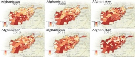
Each of the 24,000 dots on this map of London has been coloured according to its most frequently reported crime between May 2012 and April 2013. During this period, more than 250,000 crimes were reported – the equivalent of one every two minutes. Via James Cheshire
Phillip Trotter's insight:
great scoop by James Chesire - check out his scoop spot Spatial Analysis - awesome reading.

From
www

By creating a new and innovative way to look at massive amounts of patient data, one man hopes he can change the way public health crises are managed.
Phillip Trotter's insight:
By creating new and innovative visual displays out of oceans of data, Christopher Murray hopes his tool can change this situation for the better. Called GBD Compare, users can rapidly determine which diseases are most harmful to children in Africa, or view how the developing and developed worlds compare in terms of heart disease, all with a few clicks of a computer mouse. The data viz tool processes data is implemented using D3.js and uses data from the Global Burden of Disease (GBD) report, which compiles statistics, charts and graphs on causes of death and disease. “The thing that’s really neat about the visualisations is they allow people to see the problem in context – in the context of all the other problems, how it’s changing over time, how it compares to other countries,” says Murray, director of the Institute for Health Metrics Evaluation (IMHE), based in Seattle. GBD is an important project and the new visualization tools are effective and easy to use. Click on the image or title to learn more.
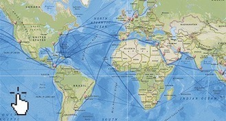
Investigate for yourself the mechanisms of global trade
Phillip Trotter's insight:
Nice catch from jed over at 4DPipeline.

In recent years, visualization has become an all-purpose technique for communicating and exploring data within the humanities. There are a wide availability of tools offering different points of entry from IBM’s Many Eyes to Gephi to Tapor 2.0. Projects like the Visual Thesaurus, Mapping the Republic of Letters, and Hypercities, among countless others, all engage with visualization as an integral part of their scholarship. Yet, they do so in very different ways and from a wide variety of disciplinary perspectives, leaving us to question: what is visualization in the humanities? Why do we use it? How do we use it? And to what end?
Phillip Trotter's insight:
Great article on when, why, how and which data visualisation tools and techniques to use. Also has a link to Tapor2 project which is a personal favourite for tracking analysis tools.
Phillip Trotter's insight:
Combining the power of bing, cloud and Excel with new data visualistion functionality is the type of synergy that has sometimes seemingly been missing from Microsoft offerings. GeoFlow looks an interesting and accessible data visualization tool. Worth playing with.
Michael P. Flowers is the Director of both New York City's Policy and Strategic Planning Analytics Team, which has been leading the charge on data analytics ...
Phillip Trotter's insight:
Good presentation on how New York City use data science and analytics to effectively allocate resources.

This sortable chart lets you compare dozens of tools for functionality, skill level and more.
Phillip Trotter's insight:
if you track data visualisation tools (either for use, for market analysis etc) this is a really useful sortable table for many of the popular available tools and lets you quickly see what is available for different types of data visualisation. Useful. Click on image or title to learn more.
Nice collection of data visualization videos on VisualLoop - largely made from TED talks and other sources. Worth bookmarking and looking at when time allows. Click on image or title to learn more.

Our knowledge of the tree of life—a phylogenetic tree summarizing the evolutionary relationships among all life on Earth—is expanding rapidly. “Mega-trees” with millions of tips (species) are expected to appear imminently ( for example, see http://www.opentree.wikispaces.com ). Unfortunately, there has so far been no practical and intuitive way to explore even the much smaller trees with thousands of tips that are now being routinely produced. Without a way to view megatrees, these wondrous objects, representing the culmination of decades of scientific effort, cannot be fully appreciated. The field really needs a solution to this problem to enable scientists to communicate important evolutionary concepts and data effectively, both to each other and to the general public. Just like Google Earth changed the way people look at geography, a sophisticated tree of life browser could really change the way we look at the life around us. Our advances in understanding evolution are moving really fast now, but the tools for looking at these big trees are lagging behind. Displaying large trees is a hard problem that has so far resisted solution. We are still waiting for the equivalent of a Google Maps. However, trees with millions of tips, richly embellished with additional data, can now be easily explored within the web browser of any modern hardware with a zooming user interface similar to that used in Google Maps. Via Sakis Koukouvis, Dr. Stefan Gruenwald, Robin Lott
From the Eponymous Pickle (a great blog): Tableau provides a paper on data visualization. Requires Registration. " ... This paper traces the history of visual representation, from early cave drawings through the computer revolution. It also examines the different styles of data visuals, discusses some of the barriers to making effective visuals and the methods used to overcome those barriers. ... Read this paper to learn about: the importance of context in visualizations ... human perception's capabilities and limitations .... the power of using data to tell stories . Click on the image or title to learn more.
|
Community Resource for the VIZBI conference series on computer methods for visualizing biological data, including genomes, protein sequences, phylogenies, macromolecular structures, systems biology, microscopy, and magnetic resonance imaging.
Phillip Trotter's insight:
If you are fortunate enough to be in Sidney on the 29th of May this is a must not miss event. David Goodsells illustrations have inspired a generation of scientists and artists, His watercoloured biological illustrations directly influenced some of the leading biomedical animators including Drew Berry and team and helped fire imaginations and understanding of molecular machinery. Really hoping VIVID sydney record this and make the recording available at a later date. Pure Awesome.

Science and art don't intersect nearly as often as they should, but when they do, the results can be an astonishing blend of expression and fact. These are the best science and engineering visualizations from 2013.
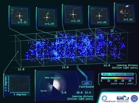
... figuring out the universe is tough. There’s all these weird things — dark matter, quasars, cosmological expansion — that are genuinely difficult to get a good handle on. So anything that helps come to terms with how the cosmos works is commendable, and for that reason I really like this new 3-D map assembled by scientists working with the National Astronomical Observatory in Japan using data from the Subaru Telescope.
Phillip Trotter's insight:
Great short astronmy article in Wired on the new 3D map from the national Astronomical Observatory in Japan. Article gets extra points for using NASA's brilliant timeline of the universe graphic representation of the evolution of the universe over 13.77 billion years developed for explaining the Wilkinson Microwave Anistropy Probe.
Phillip Trotter's insight:
Awesome overview of modeling and visualization undertaken by NASA over the last 30 years.

Jed Fisher's curator insight,
July 18, 2013 5:44 PM
Neat - history of NASA visualizations (fluids, air, etc). What's really amazing is that we've gone from one GPU core to NVIDIA Tesla Kepler K20X with 2688 CUDA Cores at 3.95 Tflops! Perfect for Seismic processing, CFD, CAE, Financial computing, Computational chemistry and Physics, Data analytics, Satellite imaging, Weather modeling.
From
vimeo
Presented at the MIT Media Lab on April 4, 2013. A peronal preface: http://worrydream.com/MediaForThinkingTheUnthinkable/note.html For more information about…
Phillip Trotter's insight:
Bret Victor talk on media tools for thinking and how representions map to thinking and building associations which help us understand systems. Worth watching.
As the volume of data grows by the hour, take comfort in knowing \
Phillip Trotter's insight:
Great set of tools for Exel to support better data analysis.

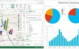
Interview: Andy Rusnak, BI and visualization expert at Ernst & Young, on enterprise reluctance with agile development, what to keep in mind when presenting data from advanced analytic sources, and determining intentional mobile needs...
Phillip Trotter's insight:
Good interview article with Andy Rusnak from Ernst and Yount on how to develop effective data visualization strategies adn patterns that he is seeing. If you want a quick overview of where data viz is currently at in terms of most businesses - this is worth a quick read. Click on the title or image to learn more.

Not all data is worthy of the effort it takes to make a good chart.
Phillip Trotter's insight:
Excellent article on when to use Data Visualisation.

PhiloGL: A WebGL JavaScript Framework for Data Visualization, Creative Coding and Games
Phillip Trotter's insight:
There are a number of webgl frameworks that are increasingly valuable including three.js and X3Dom for different types of web based 3D visualization. PhiloGL is one worth considering for data visualisation. Click on the image or title to learn more.

Is your startup struggling to solve a tricky data challenge? Data science startup Kaggle is launching a program today to rally its community of 70,000 statisticians from around the world to solve y...

SACHI the St Andrews Computer Human Interaction research group and the Big Data Lab St Andrews are pleased to announce they will jointly run a SICSA supported “Big Data Information Visualisation” summer school in 2013. This summer school is concerned with the processing, management and hence presentation of “big data”, in an intelligible form with information visualisation techniques and methods. Data-intensive researchers talk about the “three Vs” of Big Data: Volume, Velocity and Variety (see CACM post). In this summer school we aim to demystify the concept of big data by introducing a systematic, scientific and rigorous approach to tackling it. We take a blended theory and practice approach here, by providing both theoretical underpinnings and practical use of the infrastructure to process big-data and the means to understand it with information visualisation. For more information click on the image or the title.
Interactive Data Visualization for the Web by Sott Murray is a book on the brilliant D3.js data visualization library. D3.js is a key piece of javascript technology for data scientist and visualization teams needing to convey graphical summaries of data via the browser. Extremely powerful and easy to use its an essential tool in a developers toolbox. If you are not familiar with D3 or want to learn some new aspects to the library an early version of the book is available through O'reilly's open feedback publishing system. Click on the title to learn more.
|


Canvas is one of a new generation of collaboration and integration tools that are changing how organisations think of enterprise PC applications. If you are involved in data fusion and sensor integration its worth tracking.